SHarp sharK award

Revamping Claims
for Bajaj Health

Overview

I led the end-to-end redesign of Bajaj Finserv Health’s consumer-facing claims experience, one of the company’s most critical journeys, with over 1,00,000 claims filed monthly.

The focus was purely on how policyholders submit, track, and complete their claims, not on operational or agent workflows. My goal was to reduce friction, improve first-time success, and increase clarity without disrupting backend operations.

From foundational research to journey mapping, prototyping, and iteration, I owned the product experience overhaul driving measurable impact while respecting system constraints.

Category

Finance, HealthTech, Insurance

Team

1 Product Designer + 2 PMs + Engineering Squad + Ops + Medical Review

My Role

End-to-End UX, Research, Experience Strategy, System Thinking, Prototyping, Testing, Design Ops

Year

2023–24

🎯 Goal

Design an intuitive, accurate, and scalable claims experience that boosts "first-time-right" success rates while reducing customer support load and internal processing time. Enable users to submit claims with minimal effort and clarity irrespective of age, tech fluency, or claim complexity. I translated these goals into product direction, prototyping, and iterative releases validated by real user data.

⚡️ Challenge

Claims is one of the most critical journeys for Bajaj with nearly 1 lakh claims processed every month. Any design change here could drive significant impact, both positive or negative. This required precision. The core issues: scattered data, inconsistent processes, and limited visibility for users. We needed to streamline the experience, reduce errors, and support fast, confident decisions without disrupting ops.

🚀 Outcome

  • The redesigned experience delivered measurable improvements within 3 months of launch.

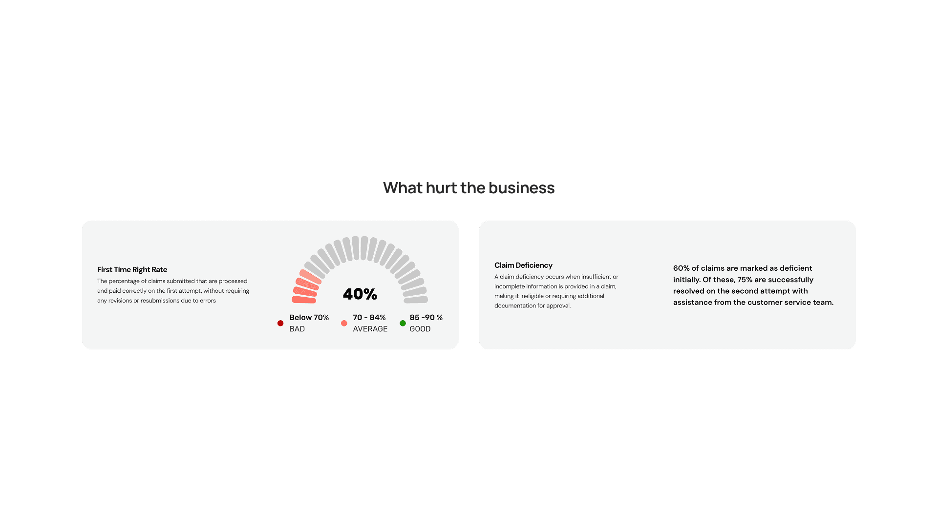
  • Deficiency rate dropped from 60% to 20% — a 40% reduction

  • First-time-right success rate increased from 40% to 88%

  • Customer queries and claim rejections decreased significantly

  • Users could file multiple claims under one illness without re-uploading documents

  • 64% increase in the claims landing-to-success funnel completion

Bajaj Finserv Health, a top health services provider in India, supports clients like Nvidia, LinkedIn, and Credit Suisse, processing over 1,00,000 claims monthly. Its offerings include health insurance, telemedicine, and wellness programs.

It began with a harsh review from one of our top client.

The objective of revamping the entire claims journey was to reduce the claim deficiency rate and improve the "first-time right" metrics. Additionally, there was a strong need to address and enhance the overall user experience.

My role

Understanding users’ pain points

Analysing design issues & competitor gaps

Business & Product growth

User Flows & Prototyping

Usability Testing

User Testing

Redesigning

Service Blueprint

Dev Handoff

CUSTOMER JOURNEY

Let's look at a patient's illness journey

For a single illness journey, the patient will have to submit multiple claims

Doctor Consultation
Claim

Doctor Consultation Details

  • Doctor Details

  • Clinic Details

  • Invoice Details

Doctor Consultation Details

  • Invoice Number

  • Invoice amount

Lab Visit
Claim

Labs Visit Details

  • Lab Details

  • Invoice Details

Uplaods Documents

  • Prescription

  • Lab Reports

  • Lab Invoice

Pharmacy
Claim

Pharmacy Details

  • Pharmacy Details

  • Invoice Details

Uploads Documents

  • Prescription

  • Pharmacy Invoice

Here’s how that journey felt.

Takes too long

Low success rate

No error checks

Missing documents

Feels repetitive

No real guidance

Too many steps

Hard to understand

Business challenges

Critical problem areas hurting both business metrics and customer experience.

Claim Deficiency

A claim deficiency occurs when insufficient or incomplete information is provided in a claim, making it ineligible or requiring additional documentation for approval.

60% of claims are marked as deficient initially. Of these, 75% are successfully resolved on the second attempt with assistance from the customer service team.

First Time Right Rate

The percentage of claims submitted that are processed and paid correctly on the first attempt, without requiring any revisions or resubmissions due to errors

Below 70%

BAD

70 - 84%

AVERAGE

85 -90 %

GOOD

40%

Frequent customer queries

22,000+ per month, leading to increased support costs

Multiple claims per member

3 claims per month on average, mostly tied to a single illness

CLAIM TIMELINE

The delay that cost us 60%

Filing a claim meant no guidance, no feedback, and long delays. This timeline captures the typical experience for 60% of users before the redesign.

USER VALIDATION

Confirming the issues

I interviewed 30 users representing key personas, senior management, corporate customers, and senior citizens, who navigated our product's claims process. Their feedback revealed unexpected challenges, which we categorised to guide our product improvements.

Scroll

Issues with claim filling journey

Issues with uploading documents

Claim Deficiency

Business Problems

INSIGHTS

Key problem areas

Extensive research revealed key problems, which I grouped into four categories to guide strategic solutions. All findings focus on the consumer journey only; no agent workflows were studied or redesigned.

Hover over cards to see details

One Event Multiple Claim

  • Duplication of deficiencies

  • Repetition of task

  • Cumbersome process

  • High claims per member

  • High agent cost

Inadequate/poor quality documents

  • Deficiencies

  • Delays in processing

  • Rejections/Partial approvals

  • High user queries

Manual Validation

  • Agents involvement

  • Delays in processing

Low/No Awareness

  • Prone to errors

  • Low FTR rate

  • Learning from mistakes

  • High user queries

How do we address
these challenges?

Mapping the scope

The claims journey revamp focused on improving efficiency, ensuring 'first-time right' resolutions, and boosting user satisfaction while reducing support load.

Increase accuracy and efficiency

Increase first time right metrics rates

Increase satisfaction rates

Goals

🛠️ Enhancing claim processing efficiency

  • Focus on reducing customer support needs.

  • Aim to increase the first-time successful claim rate.

  • Implement a guided journey to reduce deficiency rates.

  • Automate processes to reduce manual data entry for agents.

  • Decrease agent cost per claim processing.

🤝 Improving user experience

  • Provide instant help and support for quick issue resolution.

  • Ensure the journey involves minimal user effort.

  • Offer the easiest solution for reimbursements.

  • Make the end-to-end journey more efficient and effective.

  • Prioritise getting reimbursements to users promptly.

We aimed for a 5X improvement, not just 2X

Our Road to 5x vision focuses on creating an intuitive, automated user journey that maximises efficiency and exceeds expectations through smart workflows and predictive tools.

1X

Tweaking the current journey with minor fixes, but with a similar basic and manual user experience.

5X

An Intuitive & Intelligent Journey that is driven by automation where user has to put minimum effort to get most effective results at the same time is Scalable.

FROM INSIGHTS

Problem Patterns → Design Directions

Addressing each of the four major challenges separately was the most effective approach, allowing me to concentrate on each issue individually and find tailored solutions. This method enabled me to achieve the best possible outcomes for each problem.

Hover over cards to see details

One Event Multiple Claim

  • Redesign around event, not benefits

  • Link documents to health files
    to avoid duplication

Inadequate/poor quality documents

  • Digital guidance for proper uploads

  • Instant validation before submission

  • Check deficiencies (image quality, size, format)

Manual Validation

  • Automate process

  • Instant feedback

Low/No Awareness

  • Onboarding for new users

  • Digital assistance & info sections

Conceptualization

We reimagined the claim journey to prioritise clarity, speed, and success. Using whiteboard flows and user patterns, we redesigned around real bottlenecks, balancing user ease with backend feasibility, while keeping the system scalable and intuitive.

Concept 1 - Reimburse AI

Rejected - Most seamless UX, but required full backend transformation.

Users just had to upload all their documents once, the system handled the rest. It matched files, filled details, and prepared the claim automatically, making the process almost effortless. But needed major backend changes to support it.

Concept 2 - Flexiclaim

Feasible, but UX not optimal

Users could upload documents at their own pace during the illness, and submit the claim for approval once everything was ready.
It offered flexibility, but ended up making the process too long and scattered.

Concept 3 - Conversational AI

Rejected - Didn’t build trust for this use case

The entire claim process was designed as a guided conversation, helping users step-by-step, but users didn’t trust a chatbot interface.

Concept 4 - Guided claims flow

Chosen – Scalable, user-first, dev-light

Users were guided step-by-step based on their illness, helping them upload the right documents without confusion or rework.
This approach struck the right balance, easy for users, low on tech effort, and scalable across different claim types.

Other enhancements - Smart entry points

To ensure users never feel lost, we introduced smart entry points and support touchpoints across the journey, helping them discover the claim feature naturally and get guidance whenever needed.

Note: While I felt Reimburse AI had the cleanest experience with minimal user effort, it needed deep backend revamps. The business leaned toward a guided flow that offered better control and easier rollout.

Invisible Intelligence: OCR + Validation

Before jumping into final designs, one key layer we built was a lightweight OCR (Optical Character Recognition) engine to quietly handle common document-related errors, before they caused delays.

I worked on designing a set of smart checks that flagged issues users typically missed, helping them correct problems upfront without needing support or re-submissions.

These validations were grounded in our discovery insights. Based on repeated patterns, like missing sign and stamp on prescriptions or incomplete doctor details, I recommended these capabilities to tech as part of improving the submission flow.

P.S. Kudos 👏 to the tech team for cracking one of the toughest challenges, building an OCR engine that reads handwritten prescriptions with over 90% accuracy. Easily one of the best in the business.

What we detected → What users saw

What we detected

What users saw

Patient name missing

Prompt to upload a valid document with name

Sign or stamp missing on prescription

Alert to check for doctor’s sign and stamp

Missing doctor details (e.g. MRN)

Message to upload complete prescription

No cost breakup in invoice

Prompt to upload an itemised bill

Same document uploaded twice

Alert to remove duplicate and upload a new file

Wrong document type uploaded

Wrong document type uploaded

What we extracted → How it helped

What we extracted

How it helped

Patient name

Auto-filled claim form fields

Date of admission/discharge

Pre-filled timeline for faster completion

Hospital name

Reduced manual input and errors

Doctor’s name & registration no.

Used to verify prescription validity

Bill amount

Pre-filled expense summary section

Document issue date

Checked for outdated or invalid documents

The Final Journey – Scalable, Guided, and User-Centric

View PDF

This journey view shows the final validated concept that streamlined claim submission end-to-end — from intent to payout. It reflects real user pain points, product constraints, and thoughtful orchestration across multiple modules, while keeping the agent system untouched.

Scroll

Journey mapping, through the user’s eyes

Design Ideations

1000+ screens | 15+ Versions | A lot of Ideas

The ideation process was the most challenging part to navigate. With complex flows like document management, OCR, and error handling, I went through multiple iterations, learned from failures, and kept refining until the experience felt right.

Had a 'FINALLLLLLLLLLLLLL' moment 🤪

The flow was fully tested by the users

Over 60 participants tested the design using Maze. Tasks and limitations were shared via a detailed document. Testing included remote sessions via a shared link and supervised in-person sessions with diverse personas, ensuring comprehensive feedback.

Link test

41 Users

Focused group test

25 Users

Note: While I believed the Reimburse AI concept would have offered the most seamless user experience, the business opted for a more guided approach to maintain control over how claims are filed.

User testing revealed certain screens that required improvements

The redesigned claims journey

Choose who’s filing the claim

Let users select the member from their policy and get a quick view of eligible coverage. This step sets the foundation for a personalised, plan-aware claim journey.

1/7

Enter your treatment

Search for the illness or treatment name to continue. Smart suggestions reduce effort and help avoid duplicate or incorrect claims.

2/7

Add your bill amount

Select which benefits you’re claiming and enter the invoice amount. The available balance is shown upfront to avoid surprises. The header shows a persistent summary, treatment name, patient name, and navigation help, keeping users oriented throughout the process.

Only relevant benefits are shown to reduce clutter and guide users toward valid selections.

3/7

Upload your documents

Users are shown exactly what documents are needed for each selected benefit. Mandatory files are clearly marked to avoid confusion. The system checks for common issues—like missing amounts or blurry prescriptions and guides users to fix them before moving ahead.

Each document shows its current status, whether it's uploading, complete, or needs attention, so users always know what’s happening. The top summary keeps key details visible at all times, who the claim is for, illness, and total amount—so users never lose context.

4/7

Guided error handling

If a user tries to continue without uploading all required documents, a clear and focused prompt stops them. The popup highlights exactly what’s missing, so users can act quickly without guessing. This reduces drop-offs and ensures smoother, more accurate submissions.

Understand and fix document issues

When users open a folder, they can see all uploaded files and instantly spot any problems—whether it's upload failure or missing details. The system checks every document against key criteria. If something’s missing—like a patient name or doctor's stamp—it flags the issue.

Tapping on a flagged file opens a zoomed-in view with clear highlights and tips on how to fix the problem, reducing guesswork and delays. This helps users feel in control, even when things go wrong.

5/7

Verify extracted claim details

The system pulls key information like doctor’s name, date, and bill number from the uploaded documents.
Users can quickly verify or edit details directly with the help of side-by-side previews. This reduces manual entry while ensuring claims are complete and accurate.

6/7

Submit and stay informed

Users see a full claim summary before submitting, including document count, payment method, and total amount. Once submitted, a confirmation screen reassures them their claim is in process and offers a clear next step.

7/7

DIFFERENCE MAKER

File multiple claims with ease

You can now submit multiple claims under a single event without the hassle of duplicate document uploads.
For example, if you were treated for dengue and had multiple doctor visits, lab tests, and medications, all of these can be filed under the same event.

Plus, you can reuse previously uploaded documents if needed no need to upload the same prescription
or report again.

Doctor Consultation
Claim

Doctor Consultation Details

  • Doctor Details

  • Clinic Details

  • Invoice Details

Doctor Consultation Details

  • Invoice Number

  • Invoice amount

Lab Visit
Claim

Labs Visit Details

  • Lab Details

  • Invoice Details

Uplaods Documents

  • Prescription

  • Lab Reports

  • Lab Invoice

Pharmacy
Claim

Pharmacy Details

  • Pharmacy Details

  • Invoice Details

Uploads Documents

  • Prescription

  • Pharmacy Invoice

The impact of our redesign

40% fewer errors. 64% more completions. 0 changes to the backend.

Deficiency rate

40% decrease in 3 months

60%

48%

20%

August '23

September '23

October '23

First time right rate

88%

Below 70%

BAD

70 - 84%

AVERAGE

85 -90 %

GOOD

Users attaching multiple claims to one treatment

58%

57

56

55

54

53

52

51

50

49

48

47

46

45

44

40

35

30

25

20

10

0


This indicates that over 50% of our users were filing multiple claims for a single illness, thereby validating our hypothesis.

48%

Reduction in customer queries

30%

Reduction in rejection

64%

Rise in landing to success funnel

Design decisions that mattered

What We Changed

Why We Did It

Smart Checklist

Cut deficiency by 40% by guiding users up front

Date of admission/discharge

Pre-filled timeline for faster completion

Real-Time Validation

Stopped bad submissions early → 88% first-time-right (FTR) success

Human-Readable Status

Dropped 22,000+ queries by replacing claim codes with simple status messages

Document Reuse

Solved repeat claims under same illness → reduced friction

Guided > AI Flow

Faster adoption, simpler onboarding, scalable without backend overhauls

This project taught me that even small, thoughtful shifts, when rooted in the right insights, can flip critical journeys without changing a single line of backend code.

🏆 Recognition

I was honoured to receive the Sharp Shark Award for my work on the claims redesign project. The recognition was for design ideation, attention to detail, and going the extra mile while driving the reimbursement journey.